I created and designed an application called SubQuest based on the “Subscription Dashboard Scenario” criteria. SubQuest allows users to keep track of all the products and services they are subscribed to. When using the application users link their bank account to be able to view their monthly spending, see a calendar with the due dates, cancel and negotiate bill services, and even see canceled subscriptions and upcoming renewals.

The problem SubQuest faces is users finding it very hard to keep track of all the products and services they are subscribed to. Most of the users will only see their money being deducted on their bank account but do not really know how much they spend each month on them. None of the users in the interviews even knew at least one of their subscriptions renewal dates. Also, users are not taking advantage of negotiating their bills for a lower price or an upgrade.
The solution for the start up was for the users to have various ways to manage and understand their bills. This app will help the users better understand their spendings and keep track of their services and bills. It will also give them the option to allow us to cancel or negotiate their subscriptions for them or give them easy instructions on how to do it themselves.
My role in this startup was to choose a UI Kit and style guide that would work perfectly with my vision for the application, competition analysis, work on the user research, map draft, prototype, and prototype testing of the website.
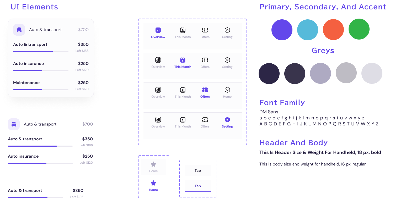
I used a budgeting and analyzing UI Kit because I felt it could help users to better visualize and keep track of their subscriptions. I liked the way it would also break down different types of services as well as show the budget not only with the numbers but the bars.
Below shoes the style guide the UI Kit offered.
.png)
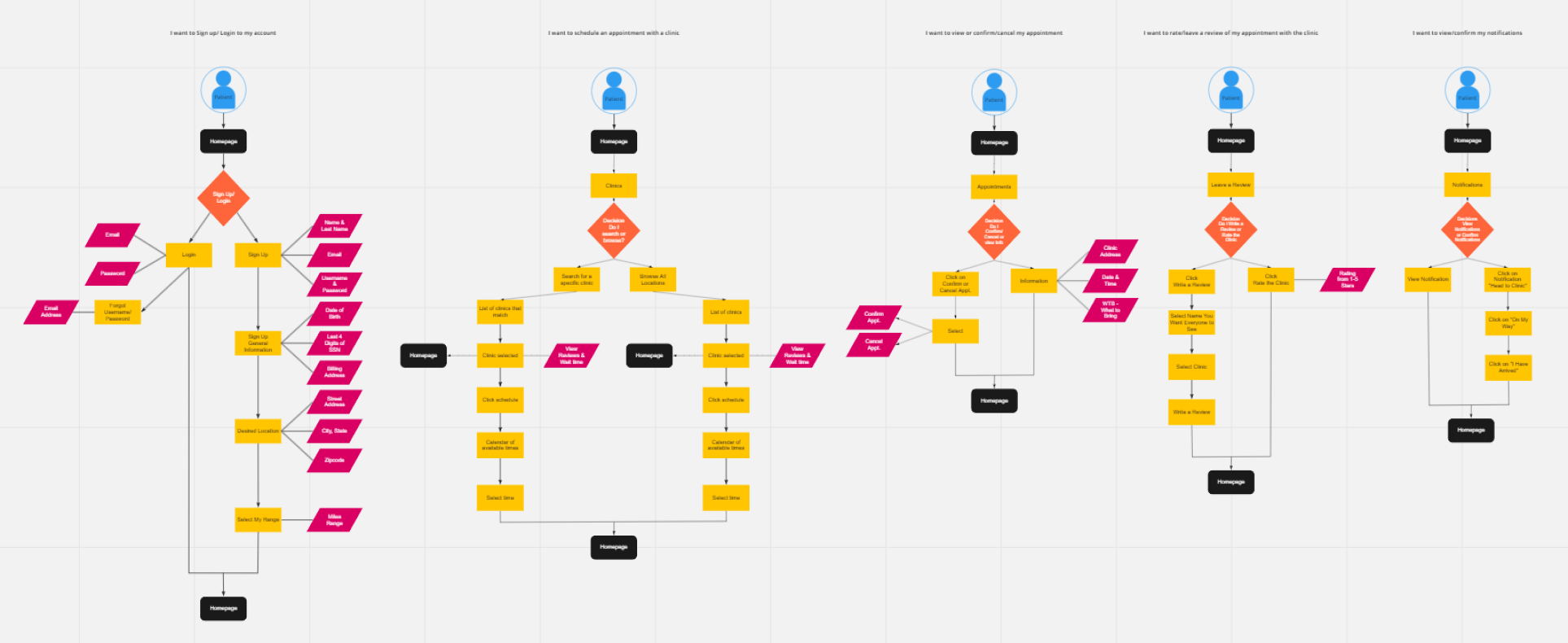
I decided to use Miro to create my user flow and red routes. I mainly focused on five critical tasks:
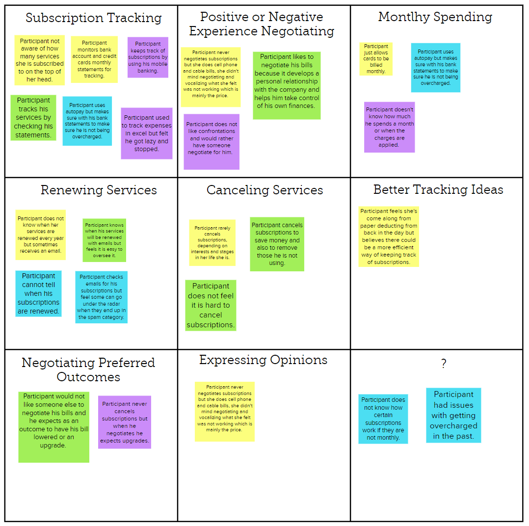
I decided to use the application MURAL to create my research synthesis. I decided to take main bullet points from each of my interviews and categorize them into the section they would belong. I divided it into 9 different sections to allow me to see the pattern in the answers and better create my prototypes.
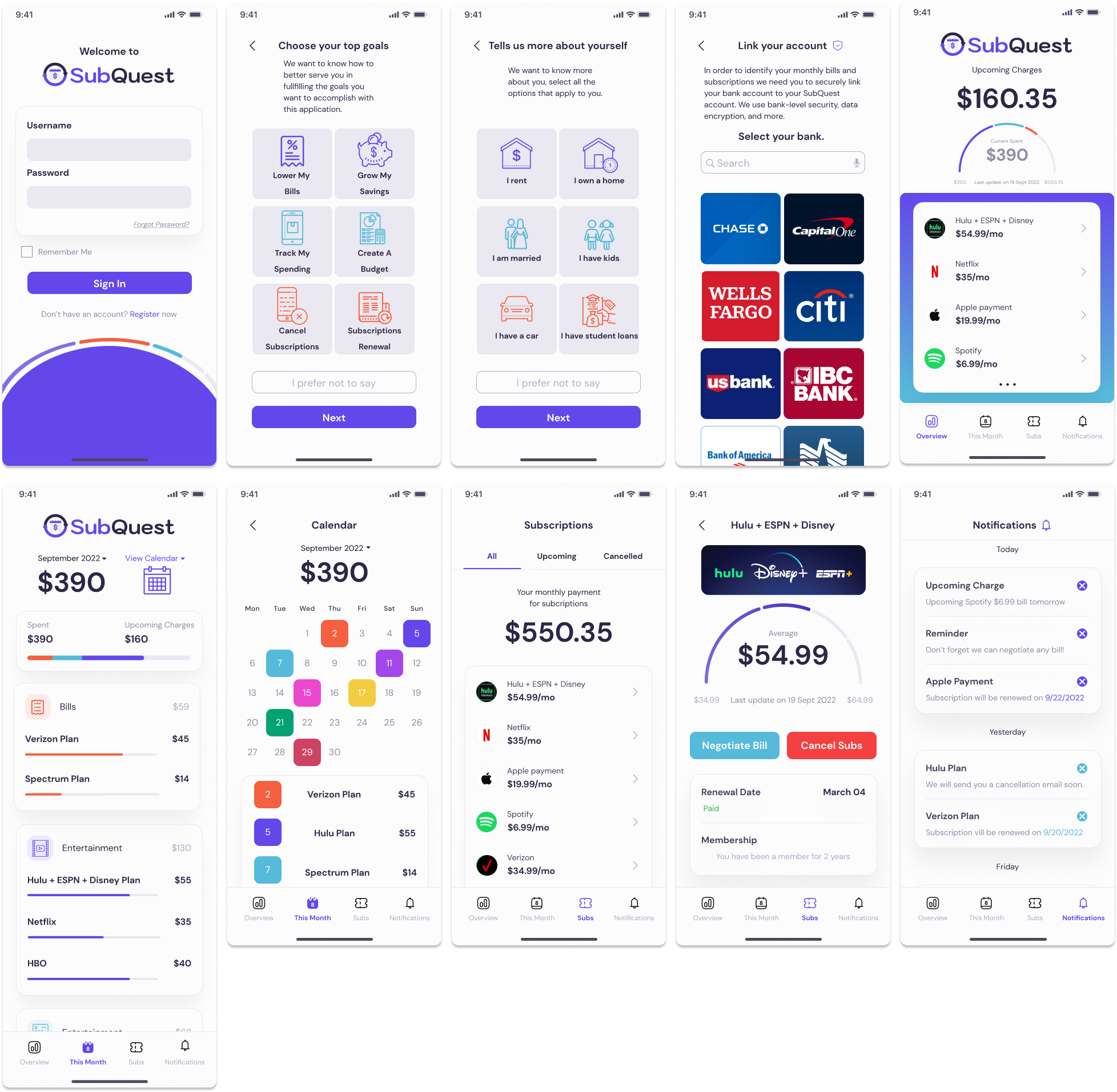
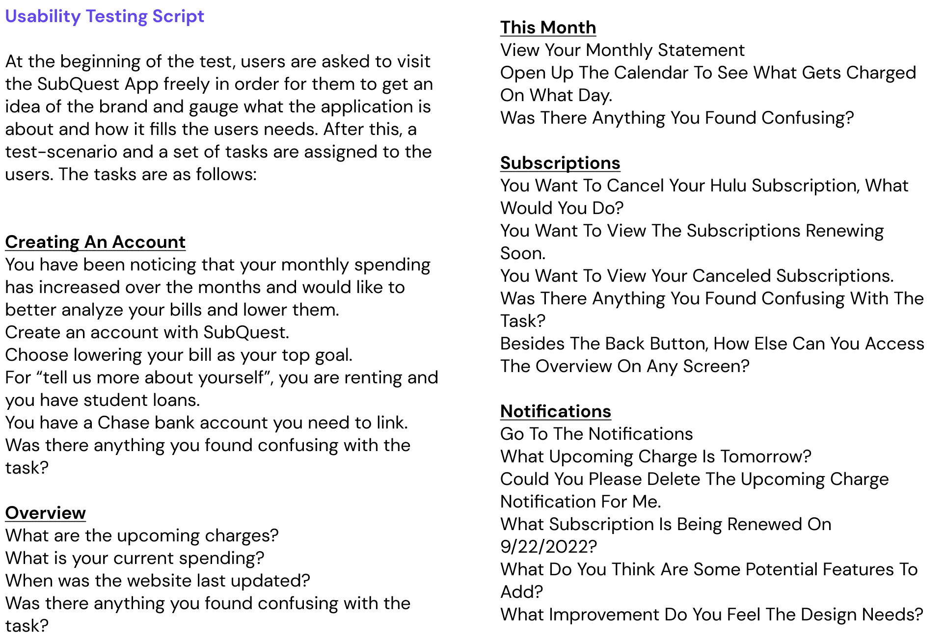
When first creating the prototype for this design sprint I wanted to keep in mind what the scenario called for, which was creating an application that allowed users to have a comprehensive view of their spending, unsubscribe from services they no longer need, be notified of renewals and other important tasks. I also had to make sure I added a way for the users to link their bank accounts.
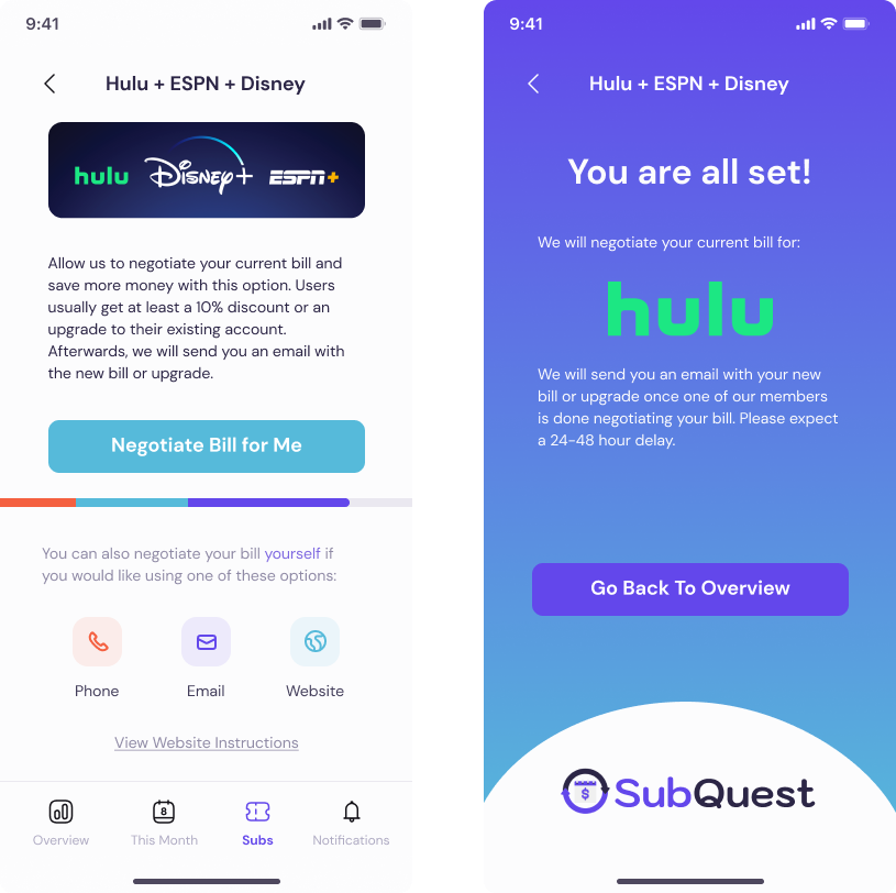
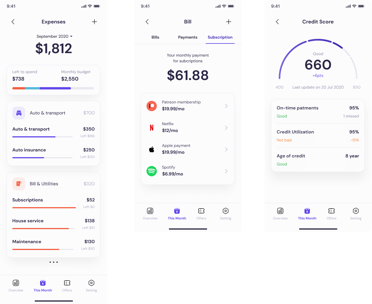
The users are given four tabs which are crucial, overview, this month, subscriptions, and notifications. Overview allows users to have a concise idea of their subscriptions and shows the monthly spending up to that date and the projected spending for the month. This month breaks down the monthly spending into sections such as entertainment, bills, and services and shows the overall spending in each category. This month also has a calendar with the due dates. The subscription tab will show you the details to each subscription alongside the option to cancel or negotiate a bill. It also shows you upcoming renewals and canceled subscriptions. Lastly, the notifications tab will inform the users of any upcoming bill, renewal, cancellation and possible negotiation option.
Users are not able to see the main difference between colors of buttons for negotiating bills vs cancel subscription due to being the same color.
Summary:
• Users were confused because both buttons were the same color as the action buttons and it was hard to distinguish between them.
Recommendations:
• Replace the colors for the buttons. Preferably a green and red color.
Upcoming charges do not show big enough.
Summary:
• Users were not able to answer the overview question of how much were the upcoming charges and telling me their current spending.
Recommendations:
• Make the letters bigger or closer to their corresponding budget.
Calendar shows the same colors for different upcoming charges.
Summary:
• Users were confused when the calendar showed the same color for different upcoming charges and thought some subscriptions charged twice a month.
Recommendations:
• Change to different colors for each upcoming charge.
Users are not able to go back on reset password
Summary:
• In order for users to go back from the reset password screen they need to click the back button, they were not able to
Recommendations:
• Add the action to the prototype
Users are not able to properly click on chase due to having the search bar to close.
Summary:
• Users would find it hard to click on the chase button since the search bar was too close.
Recommendations:
• Create space between search bar and chase button.
My goal for this SubQuest design sprint was for users to be able to better track their subscriptions and services as well as to be able to cancel and negotiate them. I created my prototypes with those goals in mind. Based on the user testing, I needed to improve on the prototyping of the buttons, replace colors for the cancel and negotiate buttons in order for users not to get them confused, make the letters bigger or closer to their corresponding area, change the colors for the upcoming charges in the calendar, and create space between search bars and buttons. Overall, making the improvements allowed for a more successful application.
SubQuest allowed me to learn how to use a UI Kit and fit it to my style guide and turn it into prototypes that fit my application goals. I learned how to assess competition by doing a competition analysis. I was able to look at how industry experts approached similar problems and achieved similar business goals. It allowed me to improve on my application by taking notes about what I thought worked well and what I would want to do differently. I was also able to learn from my user interviews. I realized the importance of colors and similar colors on the calendar made it confusing for them. Also, how the size of text helps users focus on a more important action.
I like that SubQuest has a lot of room for growth and improvement. I have two main ideas for the next steps in this project. I would like to show on the subscriptions screen how much the user is saving by using the application. Another idea is to create a screen for promotions. The screen for promotions would show the different promotions that are being given by subscription services for that month that the users would greatly benefit from. It could also lead SubQuest to partner up with subscription services and create our own promotions.