Matilti is a scheduling application that allows for people to view different clinics in their desired range as well as their reviews to better schedule an appointment with zero wait time. Matilti originated from my experience as a medical scribe and noticing the long waiting hours patients had to endure prior to be seen by their physician. Patients would be upset and complain about the poor time management.
The design challenge was how we could achieve lower waiting timed having both the clinic and patient in mind and being able to create a relationship between them.
The main factor to reduce long waiting times was to ask the user to allow the app to track their location in order to create that relationship between the clinic and the user and at the same time allowing the clinic to ask the user to head over depending on the distance from the clinic and the waiting time of the day. In addition, the user was also able to view the numerous clinics available in their area, schedule their own appointments, view reviews of the clinics, create their own reviews, and rate the clinic.
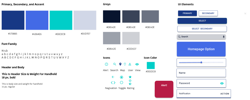
I worked on the user research, personas, user flows, prototypes, high fidelity mockups, and animations during all the iterations of the application’s development. I also worked on creating the name, logo, and style guide to reflect that the application is professional, trustworthy, helpful, and practical.

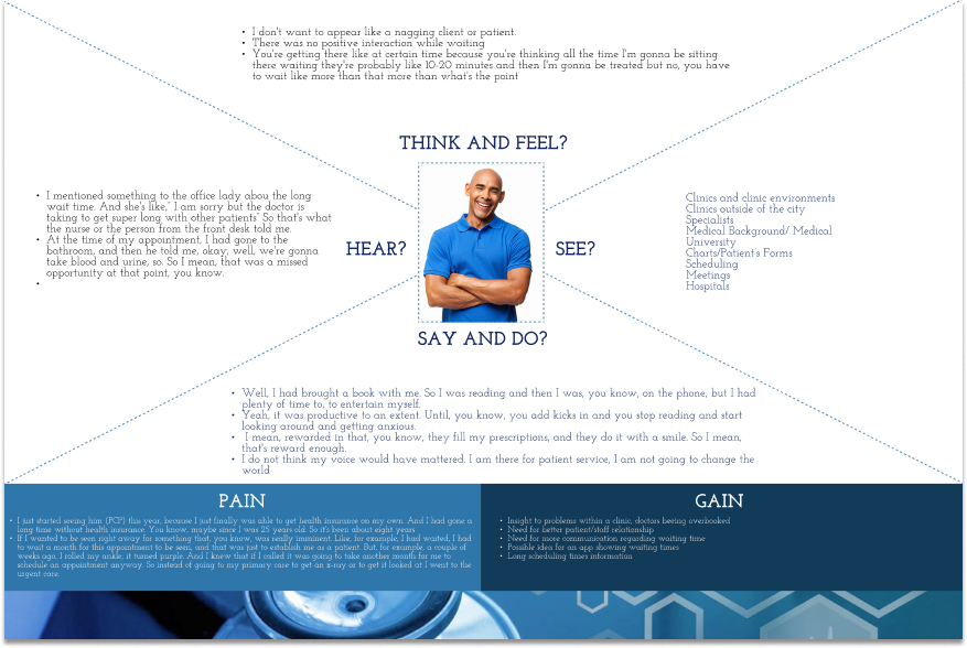
I used user surveys to assess demographics, user interviews to better understand patient satisfaction and expectations of waiting times in the medical care clinics, and usability testing.
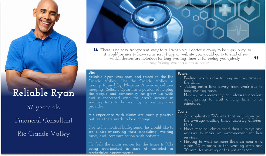
After, I synthesized my research creating an empathy map, personas, JTBD, problem statements, and journey maps.
-Patient at a healthcare clinic
-Owns a smartphone or tablet
-Usage of mobile services (2+ times a week)
-Willing to interview post survey
-Asked if participants are interested in an interview
-Local recruiting near care clinics
-Social media outreach, Facebook + Instagram
-Google Docs Survey
-Otter.ai
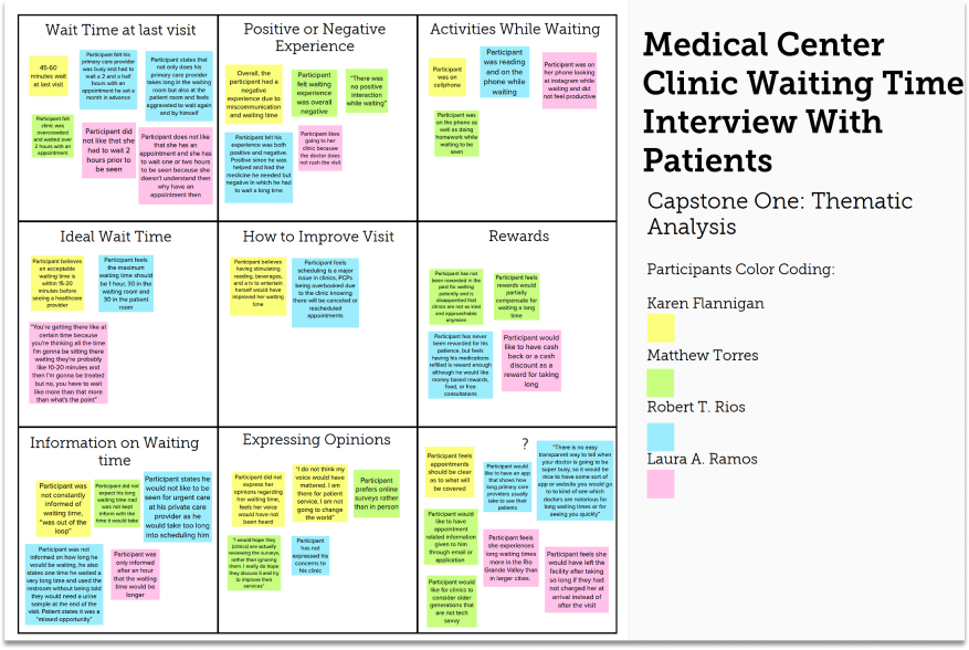
-Users did not express their opinions regarding their waiting time to the clinic, feel their voice would have not been heard
-Users had a negative experience due to miscommunication and waiting times
-Users would like to have appointment related information given to them through email or application
-User feels the maximum waiting time should be 1 hour, 30 in the waiting room and 30 in the patient room
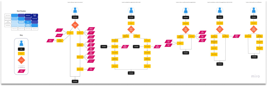
I used the website Miro to create my red routes and user flows.
I first worked on the user flows and the key. I created these main five:
Then I created my red routes based on whether they were used always all the way to rarely used, as well as from used by all to used by few.
Sketches allowed for me to start turning my ideas into something more tangible. They allowed for me to communicate my ideas and receive feedback from my mentor. I created sketches from both the application and the website.
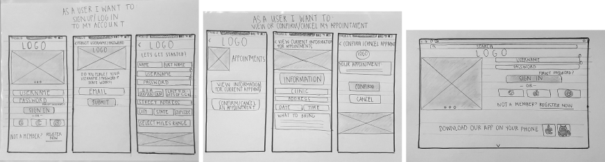
I used a pre-created wireframing set from Figma to turn my sketches into wireframes. I really liked creating the wireframes because once I started working on the prototype it was easier because the wireframe gave me the structure and form I needed. The wireframes allowed me to make faster and easier prototypes due to them creating the structure and flow I needed in my design. They helped me have a set layout with all the user flows.
Matilti’s personality is trustworthy, caring, helpful. and practical.
Matilti’s purpose is to change and better the patient’s experience in regards to health care waiting time. We use our time to help you take no time!
Rationale : I decided this personality because the main importance of the application will be that the user knows someone cares about them and values their time.
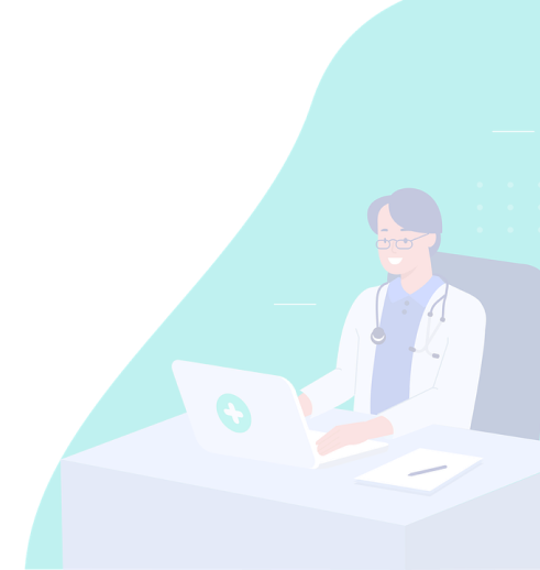
I chose this type of imagery because I wanted to convey that the brand is not just trustworthy but also caring. I want the user to know they will enjoy their appointments after scheduling them with us. With so many patients having negative experiences, I decided to use images where the people are enjoying their visit, letting them know we will be helpful, practical, and overall help better their experience.
I chose this type of UI designs because it shows professionalism and practicality. I like how it is easy to the eye, not too overwhelming in order for people of all ages be able to follow and complete any task on the application. It has subtle use of shades of blue which conveys peacefulness. I also like the drawings being used to draw attention. I particularly like the font sizes and placements of each of the images and text boxes. Everything is well organized.
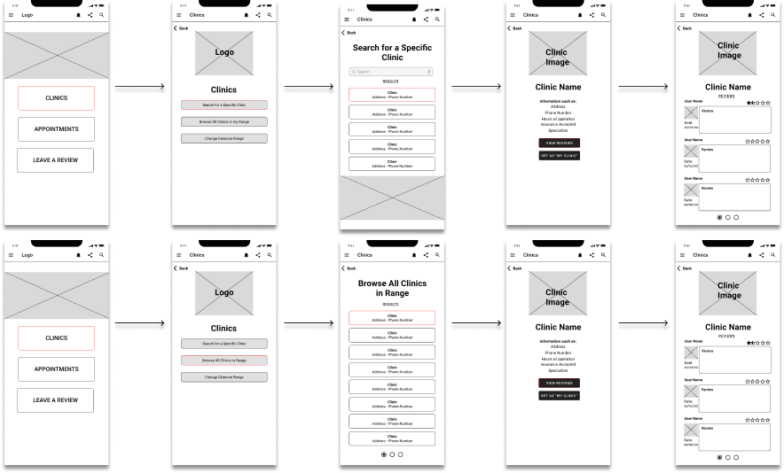
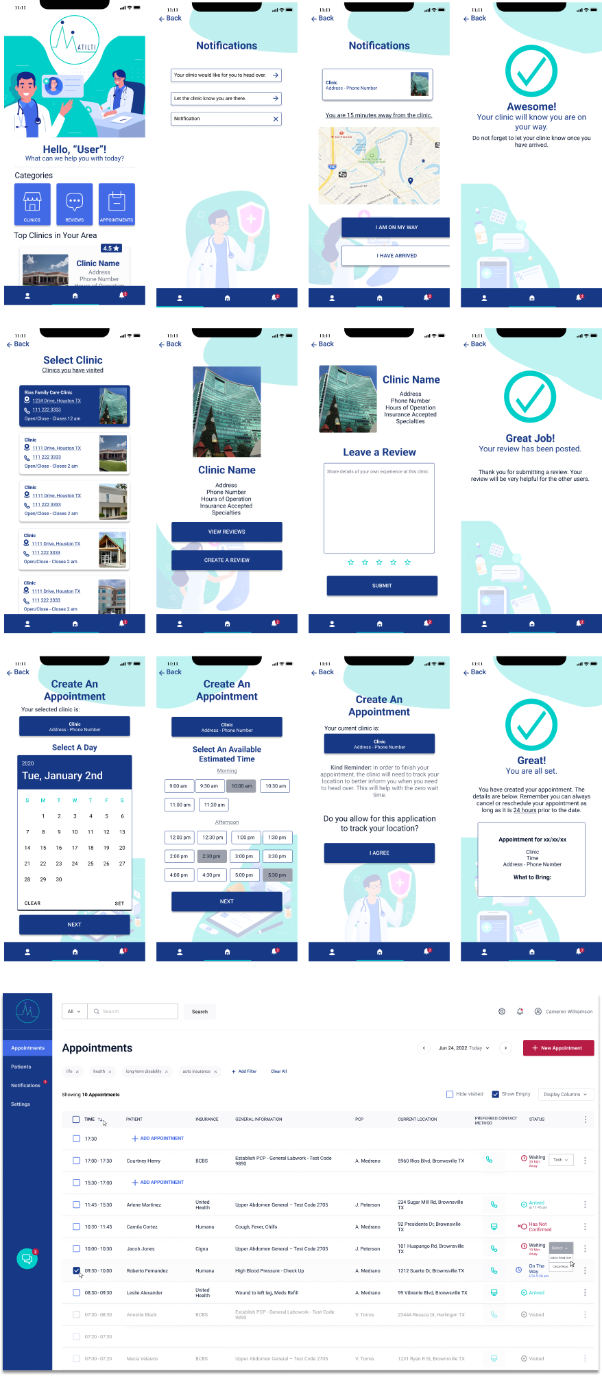
The screens created where the log in, the homepage, notifications, clinics, reviews, appointments, user account, and the website page. I made sure to create the screens that would allow of the user to create each action. In the end, I added the red routes for creating an account and leaving a review.
Each screen is created with a specific purpose. For example, notifications allows for the user to know when the clinic would like for them to head over for zero waiting time. Appointments allow for the user to manually set up an appointment with the clinic of their choice. Clinics allow for the user to browse for different clinics in their area and be able to see and create their own reviews.
Main objectives would be to receive feedback on initial impressions of the screens and different buttons across the application and uncover usability problems in the red routes.
- Is the application useful enough for users to want to download it?
- Are we solving the main issue with long waiting times?
- Are users able to understand what each button in the home page is for?
- How do participants respond to the organization of the clinics, appointments, and leave a review UI?
For this testing plan, I will be using a moderate approach due to being able to ask questions for clarification or dive into issues through additional questions after tasks are completed.
Descriptions of the participants should be as followed,
- Age between 21-75
- User with Health Insurance
- User with a smartphone to access application “on the go”
- Recruiting can be done at healthcare facilities. As well as professionals working at buildings that are known to give insurance such as schools.
Users are not able to access the notifications easily, they would need to click on it several times.
Summary:
In order for users to click on the notifications, they had to click on the smaller round circle which is hard on a mobile device.
Recommendations:
Change the prototyping clickable area to the icon instead of the circle.
Users are not able to access the homepage button besides using the back button due to not knowing the logo served as a homepage icon.
Summary:
Users were confused when asked to access the homepage without using the back button.
Recommendations:
Replace the logo with a home icon used universally
Homepage disproportionate and bare.
Summary:
Users felt the home page was not proportionate to the top hand icons, also that the home page was too big and bare. They felt it was plain and did not explain too much of the buttons or application.
Recommendations:
Create a more inviting, proportionate homepage with more explanation.
The Matilti Prototype was able to find an effective solution to the problem by hearing its users and correcting any mistakes found while user testing. The goal was to reduce waiting times at a clinic setting. I needed to improve waiting times by creating an appointment based application in which users would create their appointment and receive notifications as to when head over to the clinic for a zero wait time. Based on the user testing, I needed to improve how to access the notifications and homepage as well as creating a more appealing and proportionate homepage. Overall, after making the changes the application was effective.
Matilti allowed me to put in practice what I learned in my course. It allowed me to fully explore both UI and UX aspects such as visual hierarchy, balance, design thinking, typography, ideation, sketching, wireframing, research, and interviews. While creating this application, I realized that in order to be more efficient I needed to create components to save time. I would change the visual design and size regularly and creating components would have been useful.
Matilti has so much potential for growth. I believe the next steps could be a chat room in which the user can communicate with their clinic as well as with other users and share experiences or useful information.