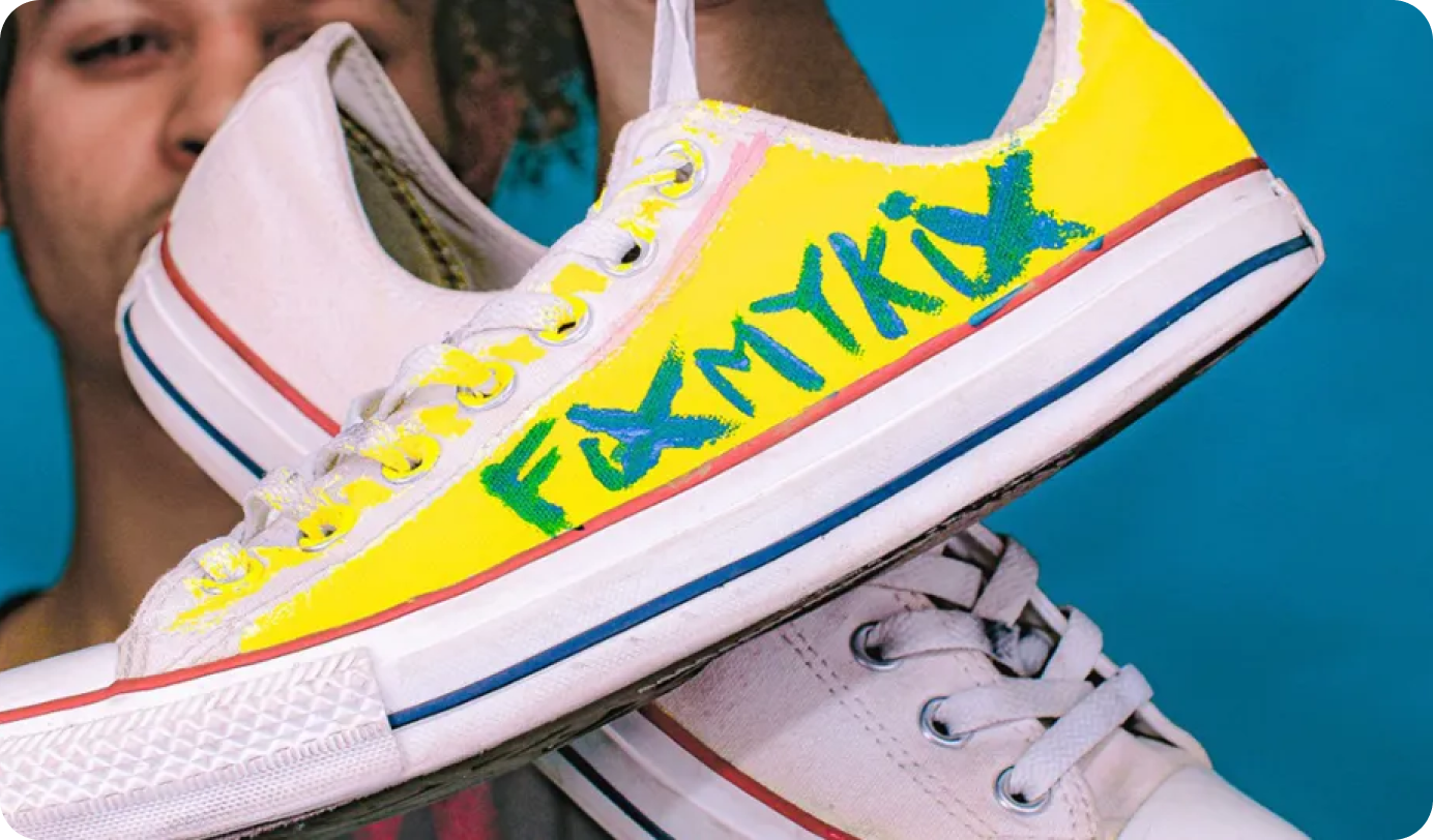
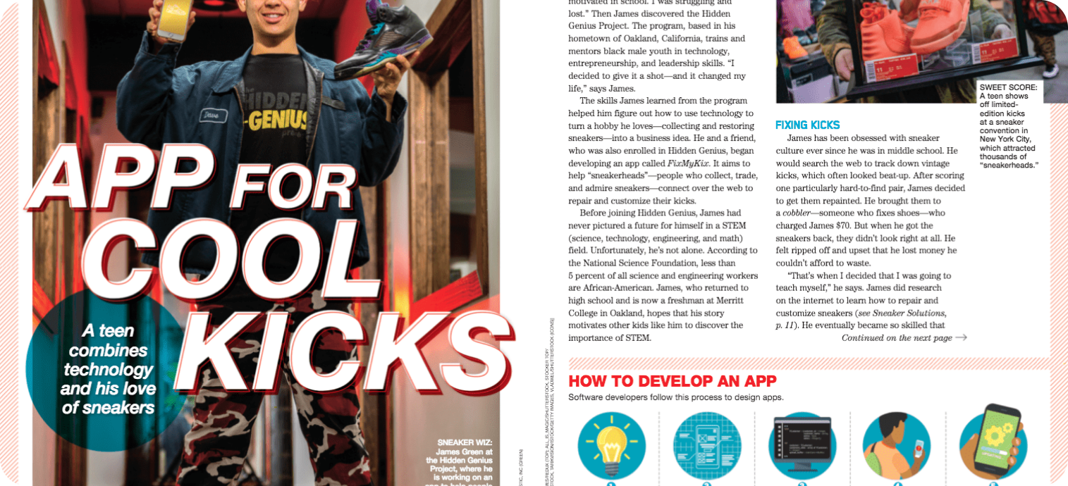
Alongside a team consisting of 3 UI UX design students, I designed the application for a starter platform called FIXMYKIX. FIXMYKIX allows its users to customize and restore their pair of sneakers. The platform helps the user find the artist that will like to use for the services through searching filters. The application also sells merchandise and offers articles, shoe art spotlight, and testimonials.
The problem FIXMYKIX users are facing is the struggle to find artists with experience to customize and restore their sneakers. Usually, the users do not find anyone in their area or do not find the artist that would be the perfect match for the job they want done.
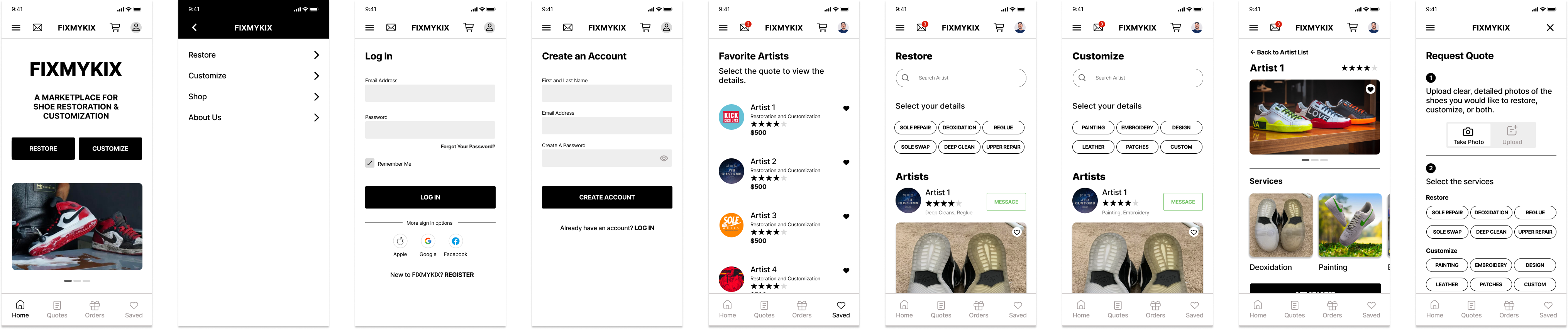
The solution for the mobile website was to allow users to browse through various artist and pick their perfect match. We were able to do so by adding search filters, an option to request a quote, and creating a messaging platform. The user is also able to view all the services the artists provide, a detailed biography and years of experience, and images from their previous orders.
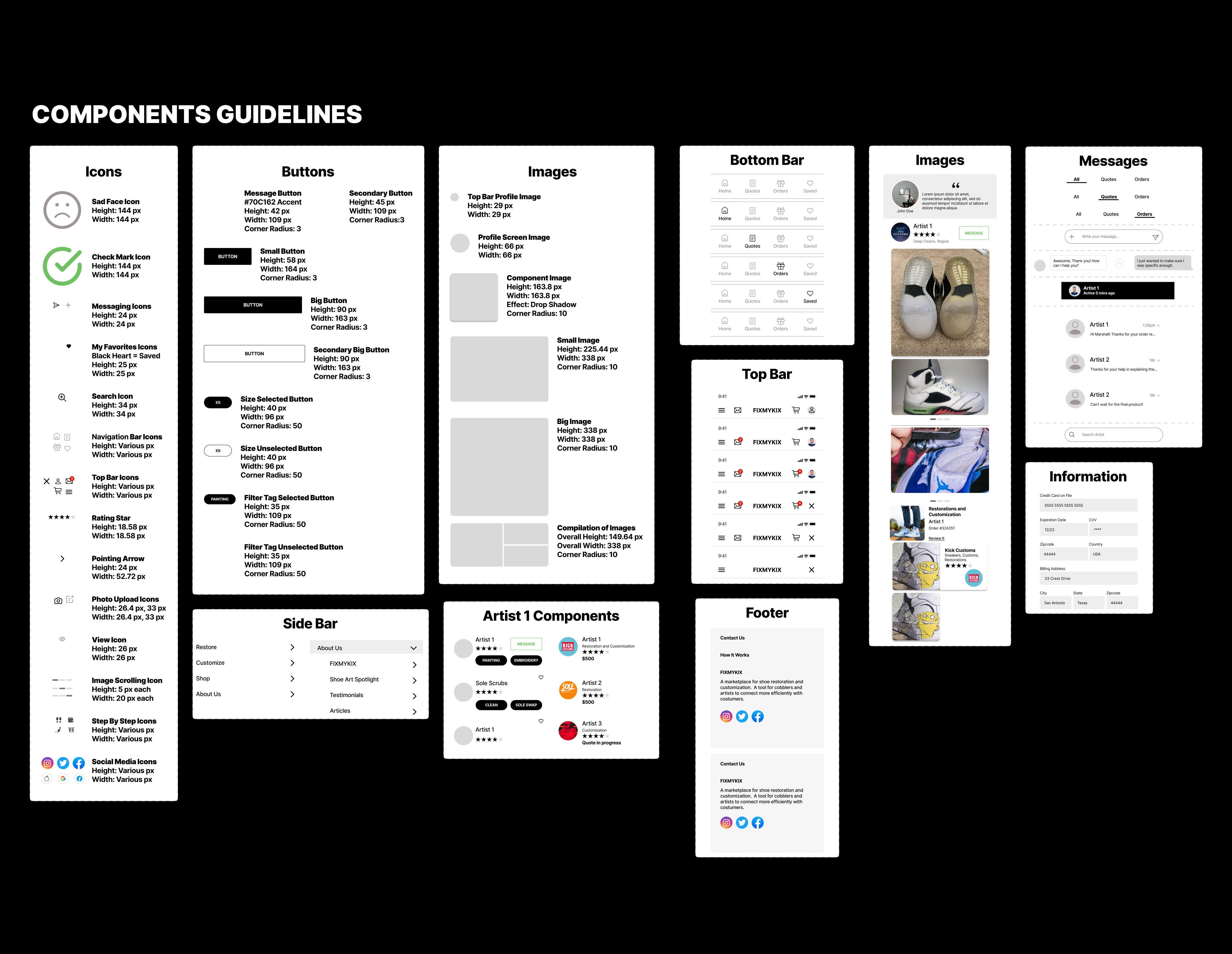
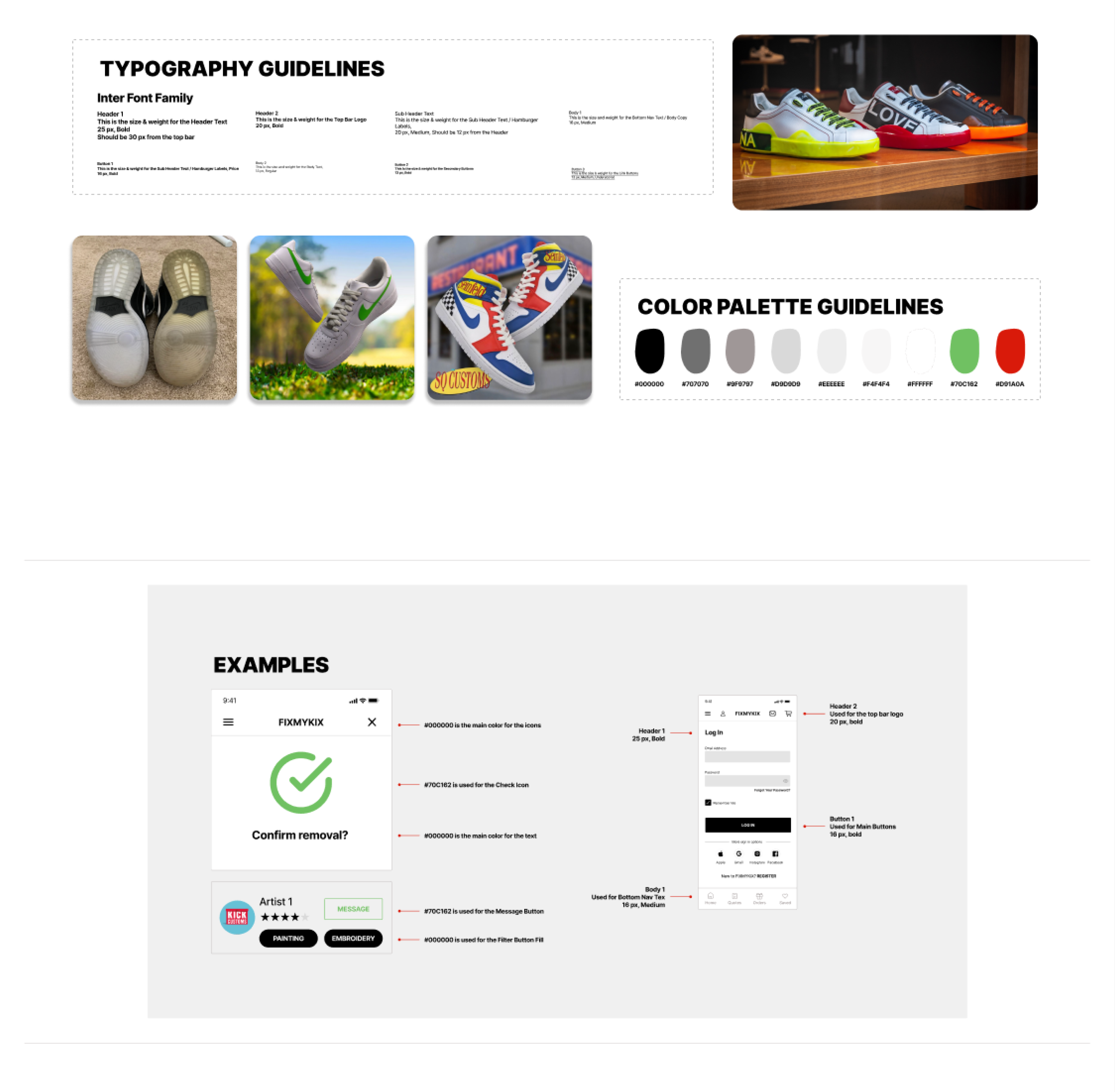
I was responsible for redesigning the mobile website alongside with a product team. Developed the mobile website’s wireframes and clickable prototypes to showcase the user experience. I conducted qualitative and quantitative user testing to support design direction and solve usability problems. Lastly, I solely created guidelines to be given to the developers for an easier transition.
As a team we decided to focus on three main user flows. The three main flows were “customization and restoration”, “my quotes”, and “my orders”. From there we were able to create nine tasks to help us create our wireframes.
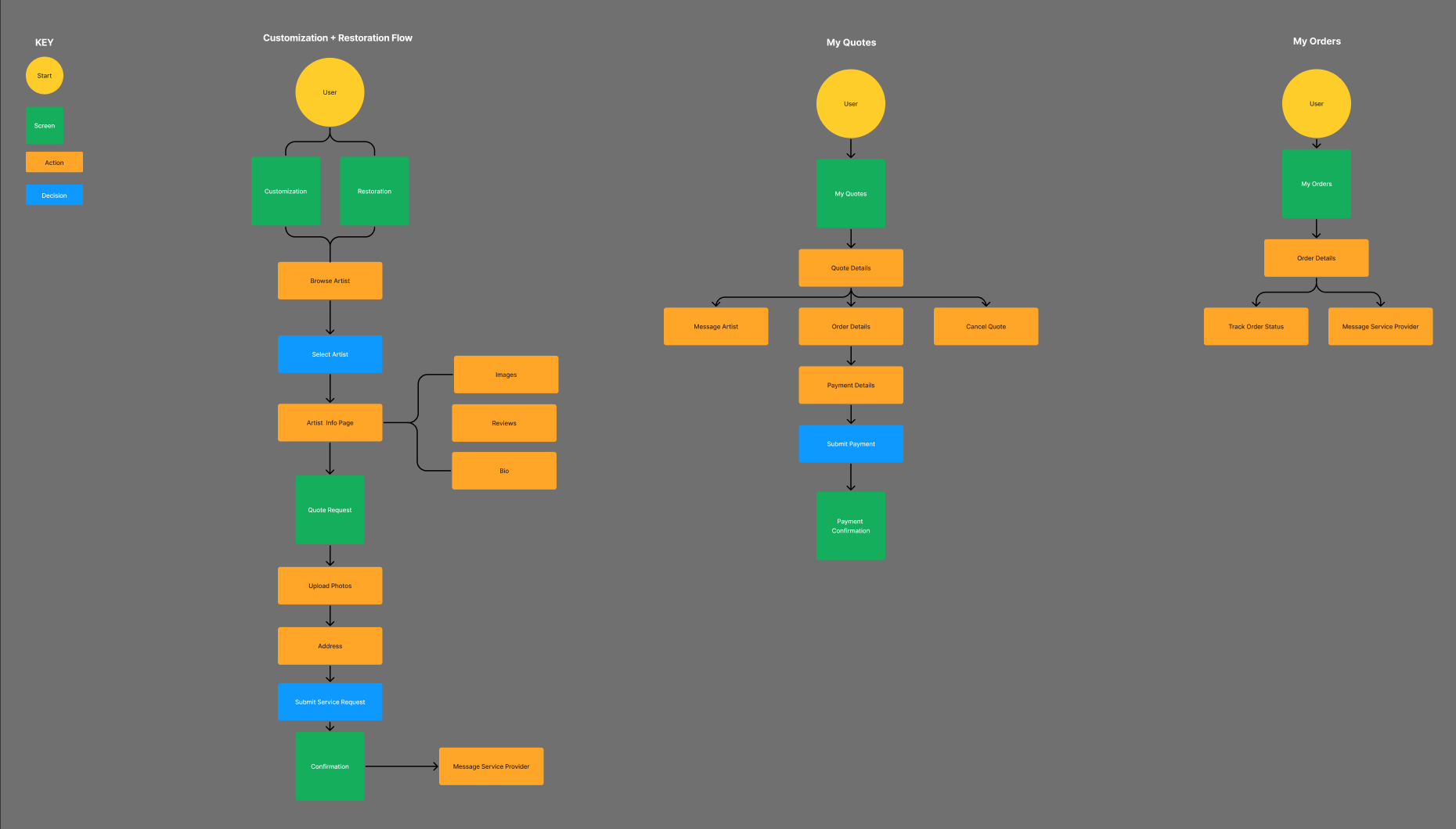
The wireframes allowed us to have the structure and form we needed. The wireframes helped us save time making faster and easier prototypes due to helping create the structure and flow we needed in the design. They helped have a set layout with all the user flows.
When first creating this prototype alongside my team, we wanted to keep in mind what the stakeholder wanted to see in the design and what he wanted to accomplish, which was a platform to connect their users to an artist to help them customize and restore their sneakers. We also had to make sure to add the option of requesting a quote, messaging the artist, and view other services such as the shop and articles.
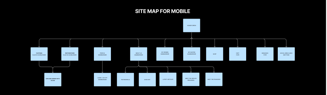
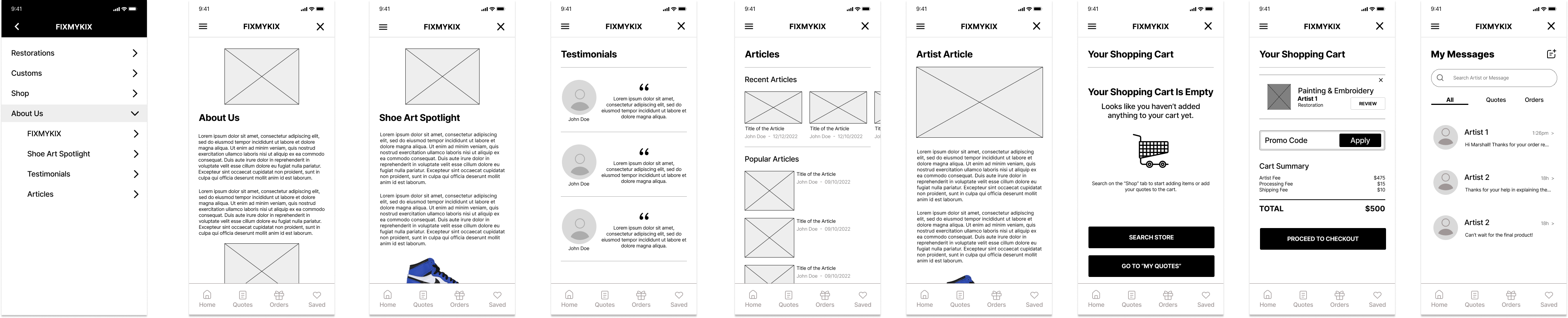
The users are given four options on the side bar which are restore, customize, shop, and about us. About us as a subcategory that shows the FIXMYKIX biography, articles, testimonies, and shoe art spotlight. Their options are to better serve the user and allow them to easily find what they are looking for or discover something new. We also made sure to have the user profile, cart, and messages at the top of the screen and to have home, quotes, orders, and saved items to show important calls of action on every screen.
For the usability testing sessions, we interviewed 10 people that fit into the app’s target demographics, sneakerheads between the ages of 18-35 who are interested in fashion and art. All 10 interviews were conducted remotely. Each interview lasted about 30 minutes. The goal was to convert users into paid customers and our problem was that users are unsure of the main call to actions. We asked our users to complete these twelve tasks.
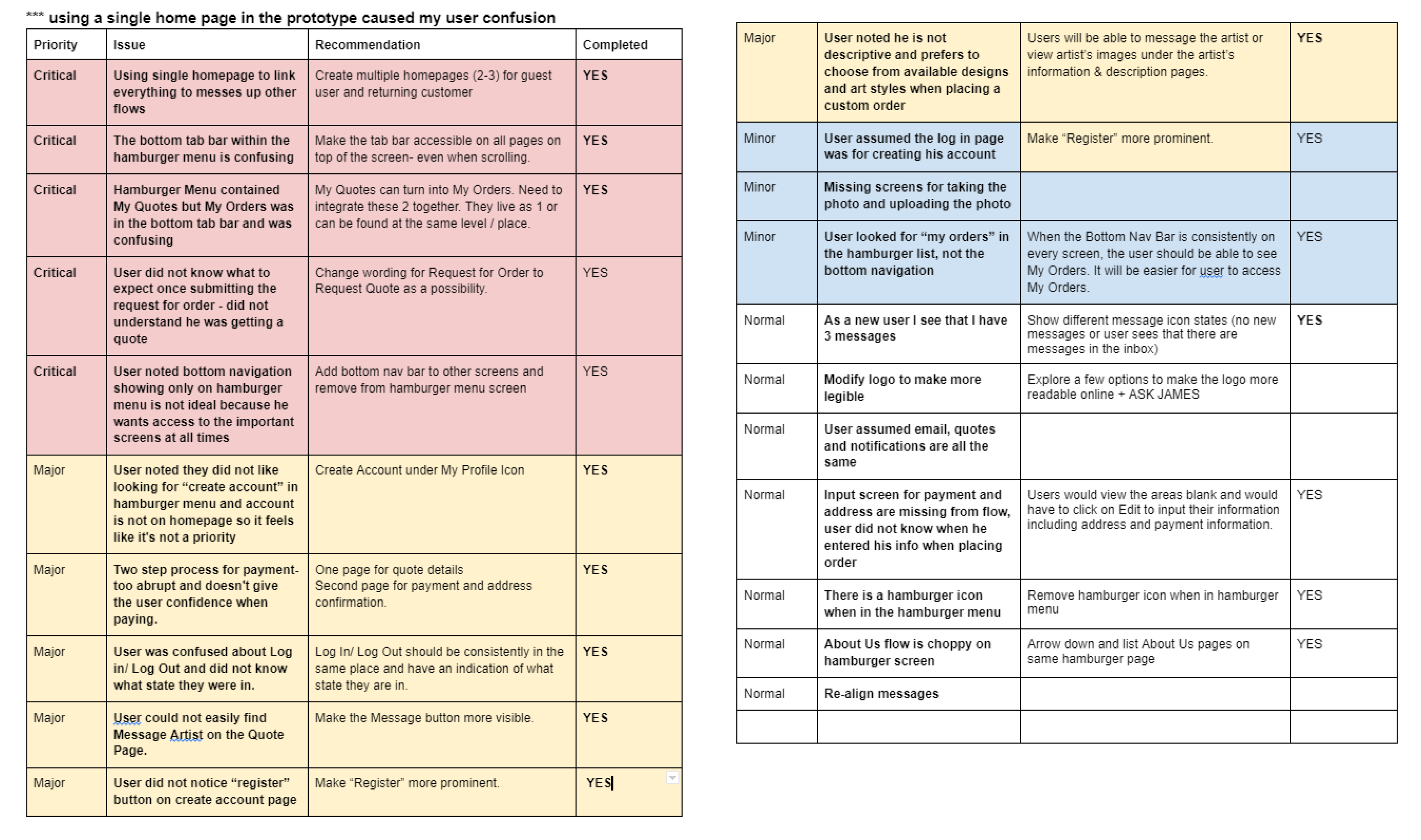
We categorized our findings as critical, major, minor, and normal. We then wrote our recommendations and whether the issue had been resolved or not. It is shown on the pictures below.
Our goal for this mobile website was for the user to be find their best match and decide to customize or restore their sneakers with the artist.
We created our prototypes with that goal in mind. Based on the user testing, we were able to improve the prototype by making the tabs more accessible on all of the screens, we created different homepages for guest users and returning users, we changed the wording to tasks to avoid any confusion, we created different screens to allow for a better flow of several tasks, and we made sure to have all of the buttons and bars consistent.
Overall, making these changes allowed for a more successful platform and our stakeholder felt we excelled his expectations.
FIXMYKIX allowed me to learn how to work with other UI/UX designers. When working with a team, you have to make sure you are expressing your opinions and ideas in a concise manner to avoid any confusion. We all worked to achieve our common goal in an effective way and learned from each other along the way. I learned to create guidelines that will be useful for the stakeholder when handing it over to the development team.
Additionally, I learned the priority to user test and make sure the users are able to understand and be able to use the mobile website to the fullest extent. We noticed how the user was not able to easily navigate through the website and it made them not want to continue browsing. We had to make the necessary changes such as more clear tools and labels. Lastly, I learned how important it is to listen to the stakeholders and make sure you are creating their vision when working on the prototype. It is extremely gratifying to see their excitement when viewing the high fidelity design and knowing it was exactly what they wanted and more.
The way we design the prototype for FIXMYKIX allows for the addition of more ideas.
I believe that a possible next step would be to add already customized shoes to the shop section of the mobile application. That way, users who were uncertain about customizing their shoes could browse for already customized shoes. They would also be able to get a new pair of sneakers without having to wait to get them customized. Also, the artist would be able to sell their own creations.
This would require a new filter in the shop section that had options such as sizing, gender, colors, and style.